- May 2, 2022
- Patrick Minder
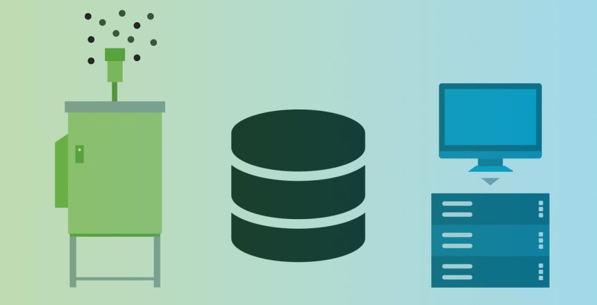
The latest technologies allow the measurement and monitoring of aerosol particles in real time. A measuring system continuously aspirates air and measures and identifies the particles contained in it. This is also the case with the measuring systems from Swisens. Every second, these measuring systems generate data on the airborne particle composition. Over a longer period of a few months or even years, a large amount of data is collected. How can we process, analyze and verify all this data? In this article, we will show you one way to analyze aerosol data from real-time measurements using our measurement systems and software solutions.
Analysis of aerosol data from real-time measurement
Before we get started, we need to define some terminology to better understand the sections that follow:
An event is the smallest unit you will encounter. Every particle that flies through a SwisensPoleno generates such an event. An event contains all properties of the particle measured by the system:
- Time-resolved trigger signal
- Holographic images captured by the system’s two cameras
- Particle properties calculated from the holographic images
- Fluorescence measurement (SwisensPoleno Jupiter only)
- Fluorescence intensity spectra
- Fluorescence lifetime
- Polarization measurement (SwisensPoleno Jupiter only)
More information about the measurement methods mentioned here can also be found here.
A dataset is a collection of events. Each dataset also contains metadata that describes the dataset. Here are a few examples:- Title or Designation (e.g.: 01_Hasel_Pollen_Lucerne_Switzerland).
- Status (New, Export Done,…)
- Description (e.g. measurement of fresh hazel pollen from Lucerne, Switzerland)
- Source/Measuring system (e.g. poleno-1)
- Producer/User
- Number of events in this dataset
With the SwisensPoleno system you can perform measurement campaigns. The system ID, the duration of the campaign and its start and end time are recorded. Within this measurement campaign, all measured particles are contained in the form of events. You can create a data record from a measurement campaign.
These three terms will now accompany us through the remaining sections. In the next section we will introduce you to SwisensDataExplorer step by step.
How do I analyze classified data from real-time measurements?
The features of SwisensDataExplorer at a glance
- With SwisensDataExplorer we enable you to access the data of your measuring systems. All you need is a user profile and a web browser (e.g. Mozilla Firefox).
- With SwisensDataExplorer you can, for example, display individual events, including their classification, or particle concentrations over time. Any events can be combined to datasets.
- SwisensDataExplorer offers a wide range of tools to analyze and edit the datasets directly in the web browser.
The following descriptions show you the functions of SwisensDataExplorer step by step:
Event Viewer
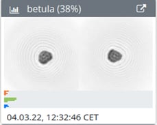
The Event Viewer can be used to display individual events. The period of observation can be freely selected. Above the images you get an indication to which particle class this event is assigned. Right next to it, the probability with which the algorithm has made this assignment is indicated. In the example below, the event shows a betula pollen grain with a probability value of 38%.
My system supports fluorescence measurement – where is this data displayed?
Below the particle images above you can see a small bar diagram. These bars represent the measured relative fluorescence spectrum. The colors correspond to the different light sources used to excite the particle. In other words, each color represents a measurement in which a different light source was directed at the particle.
- Orange corresponds to the excitation with the 280nm light source.
- Green corresponds to excitation with the 365nm light source.
- Blue corresponds to excitation with the 405nm light source.
Five bars are displayed per color, representing the five reception ranges that SwisensPoleno Jupiter measures. (357nm, 435nm, 483nm, 562nm, 676nm).
Timeseries
In Timeseries you can view, analyze and export concentration time series. Following the same principle as in the Event Viewer, you first select the measurement system and define the time frame of the observation and the classification algorithm. The concentration curves of the individual particle classes are displayed in the graph. The concentration curves can be exported as a CSV file.
How do I get an overview of my measurement campaigns and data sets?
Measurement Campaigns
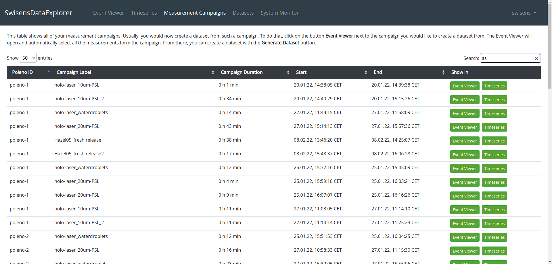
In Measurement Campaigns you can view the measurement campaigns you have performed. In this tab, all measurement campaigns are displayed with the associated labels and information. From here you can display the events measured during the measurement campaign in the Event Viewer or in Timeseries.
Datasets
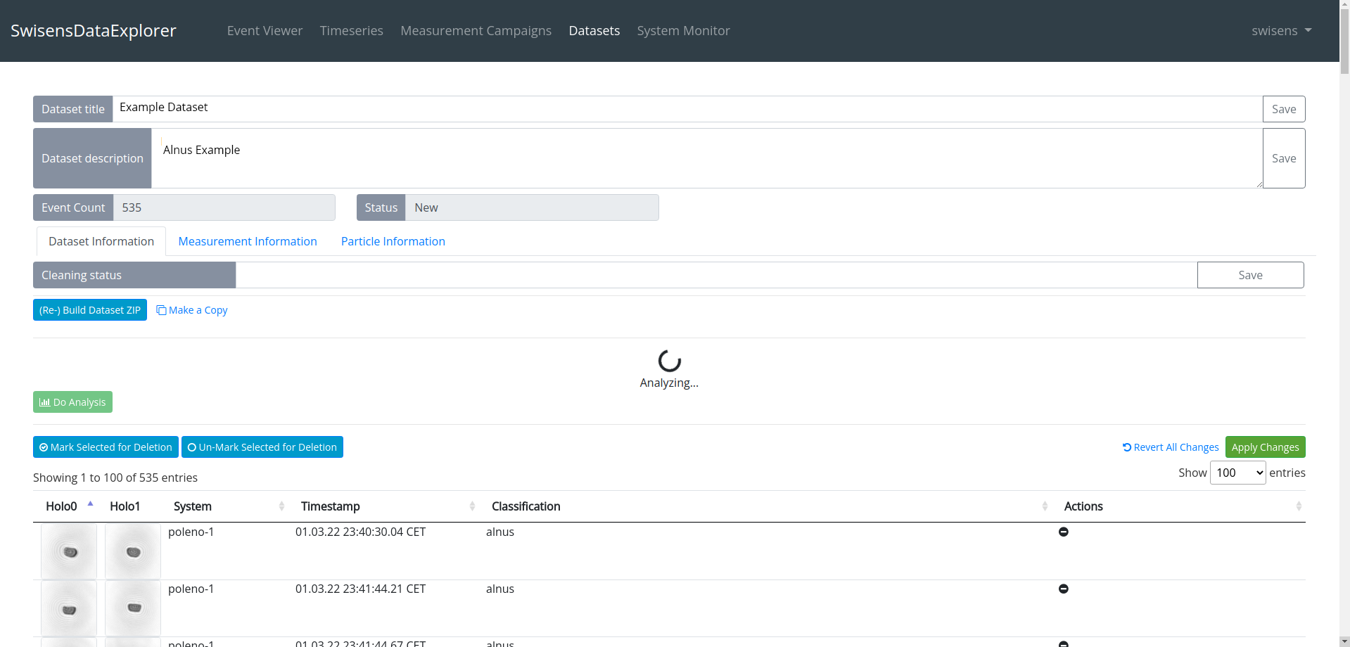
Under Datasets you can view all your datasets. These datasets are a collection of events, which you can generate in different ways:
- Via the Event Viewer:
You select an interesting group of events and click the “Generate dataset” button. - Via Timeseries:
You calculate a time series and now create a dataset by clicking on “Generate dataset”. - Via Measurement: campaigns:
You select your measurement campaign, display it in the Event Viewer and create a record there.
Dataset creation is not only a convenient way to analyze data from SwisensPoleno, but also enables export and data exchange. After opening a particular dataset, you will be offered various options for entering metadata. Below we explain how to analyze datasets and events based on the measured particle properties.
How do I analyze real-time data based on particle properties?
With SwisensDataExplorer you can also analyze particles based on their measured properties without them being classified by an algorithm. The following section gives you an overview of the data analysis tools included in SwisensDataExplorer:
Summary of the most important functions and tools
The current tool palette enables the analysis of the properties of the holographic images and the fluorescence measurements of SwisensPoleno. From the holographic images of SwisensPoleno, morphological properties of the particles can be determined. With the following tools you can filter the particles within the data sets according to their properties.
Holography
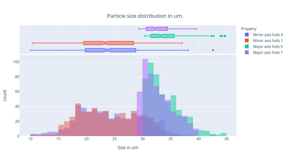
- Histogram of “Major Axis” and “Minor Axis
- Histogram of the Eccentricity, Solidity and mean Intensity features
- Parallel coordinate representation of the image analysis features
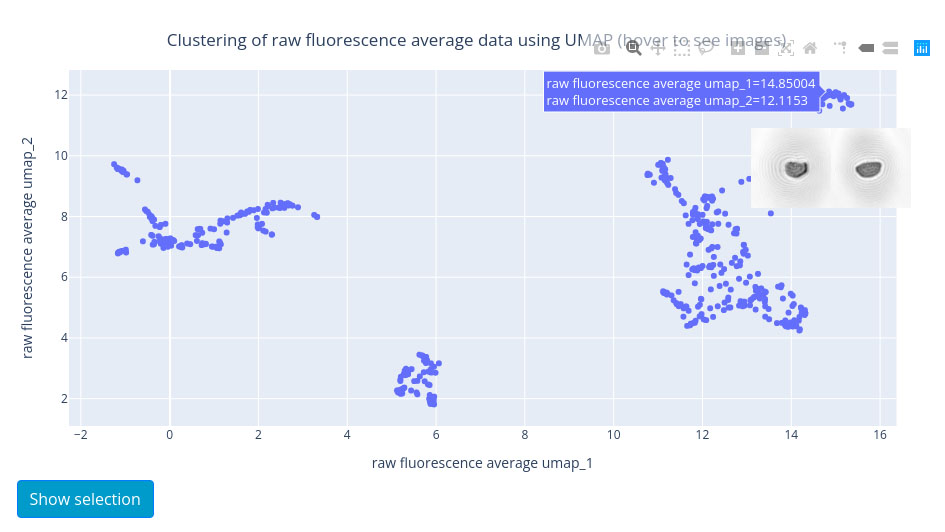
- UMAP (dimension reduction) of the image analysis features
Fluorescence
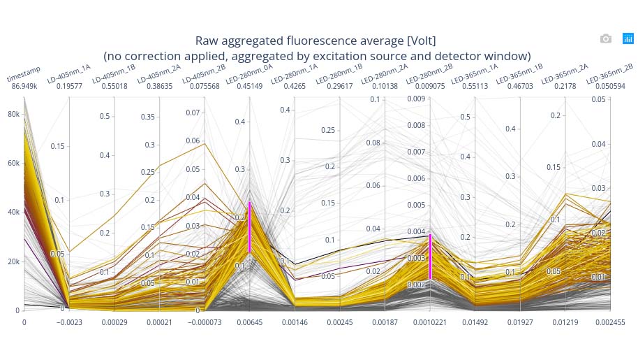
- Parallel coordinate representation of fluorescence intensity
- UMAP (dimensional reduction) of the fluorescence intensity
For the tools mentioned here we give you a short summary:
What is a histogram?
Histograms are usually used to visualize distributions. This example shows the size distribution from the two holographic images of the particles in micrometers.
What is a parallel coordinate plot?
The parallel coordinate plot allows the clear visualization of high-dimensional data, where each measurement event is displayed as a polyline with vertices on the parallel axes (measurement features). The color of the polylines depends on the time stamp. The later the particle in question was measured, the darker the color.
What is UMAP (Uniform Manifold Approximation and Projection)?
The Uniform Manifold Approximation and Projection allows to reduce the dimensionality of the measurement data. The high dimensional particle properties obtained with image processing of the holographic images and fluorescence are each reduced to only two dimensions and visualized as a scatter plot. Each point in the scatter plot represents a measurement event. Depending on the analyzed data, different clusters containing similar particles become visible (e.g.: large particles, elongated particles, …).
The distance between the points visualizes the similarity of the particle properties. Larger distances mean less similarity. This is true for points within a cluster and for events in different clusters.
Visualization and analysis made easy
The various tools within SwisensDataExplorer not only allow visualization of particle properties, but can also be used to efficiently highlight areas of interest for closer examination. This can be used, for example, to clean up datasets, or to view new yet unknown particle groups in isolation. Now you have learned about the possibilities to analyze aerosol data from real-time measurements with our measurement systems and software solutions. The currently available functions are continuously extended and supplemented.
Customizable Python scripts are also available to our customers for even more in-depth analysis.
Would you like to get to know SwisensDataExplorer better during a live demo? We would be happy to arrange a joint appointment with you: